MAKE OVERS: TINA #1
Tina sent in a few pictures and they were marvelous! This will be the first of four featuring her. I picked this pose with glasses to kick it off because glasses are difficult things to correct problems in, as they have all kinds of light effects in those lenses. Here goes...
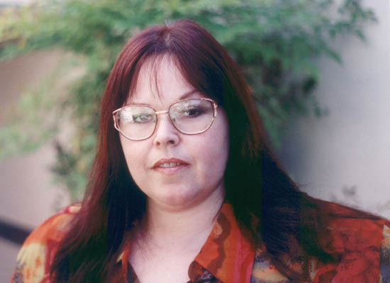
Amazing picture. Very professionally photographed. The background is fuzzy, forcing the focus on the subject, Tina. Her clothing compliments her hair tones exceptionally well. She's already a very beautiful woman. What's not to like about this picture?
Nothing. It's wonderful.
It's just not perfect. We're going for the glamour here, and glamour demands perfection. Glamour demands creating something that never has a prayer of occurring naturally, so we gotta whip out the ol' airbrush and take some action...

Got rid of that glare off the glasses. Now, if you squint and look really close, you'll see her skin tones are not uniform. The human skin seems to catch a close range of colors on a single patch, giving a pontillistic effect. While absolutely natural, it's not glamourous. I'll blur the skin areas so they won't be as noisy.

Great. Now to add some white to those eyes and teeth. I'll also make sure the eyes stay uniformly colored, getting rid of a little more glare effect. Painstaking work, this.

Let's have some more color in the lips. After I redden them, I go back with a dab of white for the highlight in the middle of the bottom lip. Without it, it'll look like she's biting her lip, an effect I don't want to have.

I had to go back and really concentrate to find the changes I made to get to the next image. After flipping back and forth, I discovered I added some cheek color, softened the outline of the face, and got rid of the white outlines on the lens edges. VERY painstaking work, this...

I took Tina's head and upper torso and made them into another layer. Then, I modified the background. I wanted it to have more richness, not being just a bland gray with green. I darkened it and increased the color saturation. While playing around, I brought out those incredible colors in the wall! I have no idea where they came from, but I fell in love with them. They're fuzzed out more, putting them in contrast with the foreground more and create a magical blend with the rest of the colors in the photo.
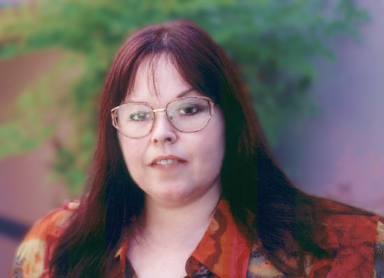
For my final touch, I decrease the opacity of the foreground layer to about 75% and have it blend with the richer colors in the layer below (which included Tina there... you didn't see the changes to her image when I modified the background because of the interposing foreground layer). Her skin now takes on a richer tone of pink and creates something I find absolutely dazzling.

Here's a comparison between the original and the final product.


Her expression lightens, the colors deepen, the glare is dispelled, and I didn't even add a fuzzy filter! I could go further, but I like the way it looks just now. Sometimes, you just gotta quit while you're winning. This is one of those times.
Looking at those two pictures there, one can see the difference between beauty and glamour. Or perhaps the one on the right is the real way "inner beauty" looks to someone who appreciates the beauty of the image on the left? Maybe I'm on to something here...
NEXT:
It could be you! Send me email if you're interested in having me convert your picture from normal to stellar!
Back to the Makeovers
Return to Zzzptm Pictures
Return to Zzzptm Main Page